iGlobe
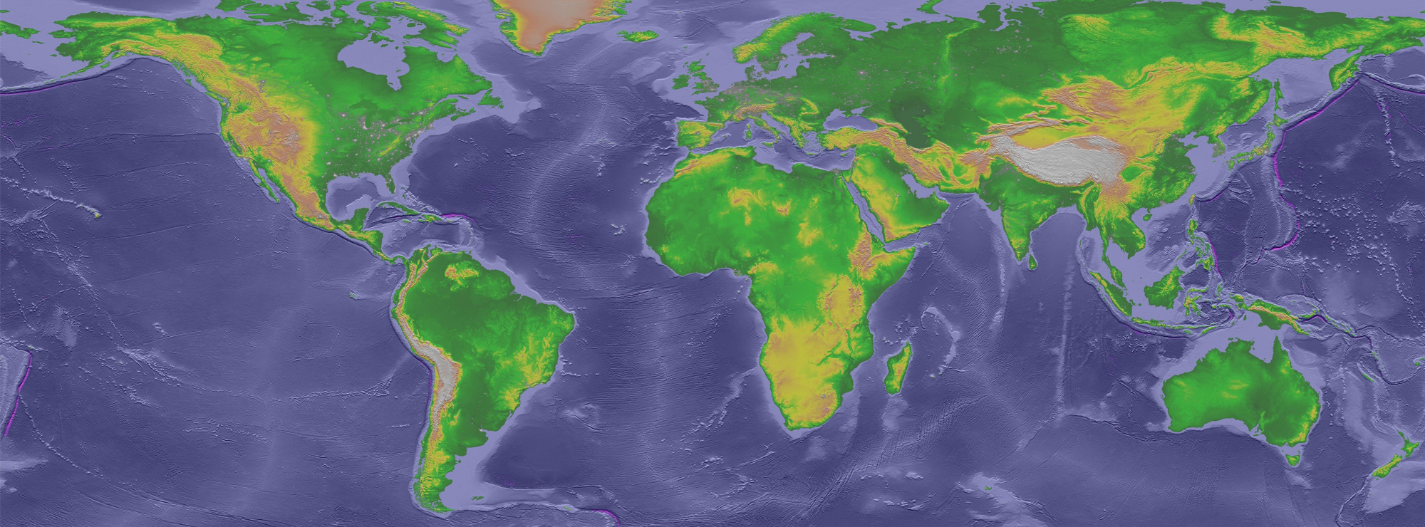
iGlobe is an interactive globe, where you can view scientific data and videos about the earth. Join us on a journey from then to now - about the sea, the climate and much more!
In our iGlobe you can see several films and simulations, with everything from the world's carbon dioxide levels and the Earth's population growth to the spread of the ice age and the movements of the continental plates. The films have a narrator's voice in Swedish and English, and you can rotate the globe with the help of a touch screen. Right now, our iGlobe includes the following movies:
- Climate Change - Fast Carbon Slow Carbon
- Blue Marble: Sea Levels, Ice and Vegetation Change
- Carbon Dioxide Concentration
- Deep-Sea Vents - Life Without Sunlight
- Air Traffic around the World
and the movies: Earthquakes - Real-time | Biosphere: Marine Chlorophyll and Land Vegetation | Human Transportation | Precipitation - Real-time
More films will be added later - feel free to tell us if you are interested in something special about Earth!
There are a number of pre-programmed films, with narration in Swedish and English. The iGlobe rotates with the help of a touch screen. Background information on the films can be found on the adjacent TV screen; it is a good idea to read this prior to the viewing.
Some of the films that are available are about:
Climate Change - Fast Carbon Slow Carbon - a film depicting the different carbon cycles, in which biological processes have a very fast cycle while other carbon is bound in geological processes that are much slower. When we use the slow carbon (fossil fuels) quickly, we throw off the balance and increase the carbon dioxide levels in the atmosphere.
Blue Marble: Sea Levels, Ice and Vegetation Change - the film shows how the ice has changed since the last glacial maximum approximately 20 000 years ago. It is exciting to look at the changes over both Europe and North America. This is based on real research data.
When the clock reaches the present day, it switches to a data model (also based on new research) that carries out an estimate of how the ice caps and sea levels will change up to 8000 years into the future. Researchers believe that large parts of Denmark and Sweden will be under water in just over 5000 years, and the last ice on Greenland will quickly melt away. This takes place even if we limit carbon dioxide emissions.
Carbon Dioxide Concentration provides an overview of how vegetation absorbs carbon dioxide, while industrial regions have major emissions. It also shows how the global wind systems spread the gases over the course of one year.
Deep-Sea Vents - Life Without Sunlight shows films from research expeditions to ocean floors, several thousand metres under water. There is no sunlight there, so life cannot get its energy from photosynthesis as it does at the ocean surface and on land. However, in some places there are ‘vents’ that spew mineral water from inside the Earth, and some animals have adapted to be able to absorb nutrients directly from this water as chemical energy (‘chemosynthesis’). This creates the foundation of different food chains that enable life even in total darkness.
Air Traffic Around the World shows where in the world commercial air traffic is found over 24 hours. Every little yellow line depicts an aeroplane, and you can clearly see how most of the air traffic is concentrated in North America and Europe.
In addition to these films, there is a large library of films and static image projections from the American Science on a Sphere (external link). You can access the library under the tab ‘Bookmarks’ on the touch screen. The films are free to use, but are not pre-prepared for our exhibition. If you would like to learn more, you are welcome to have a look through these – please let us know if you have any requests for a particular film to be adapted for our activities.
On the iGlobe we can visualize scientific data about the Earth. Join us on an exhibition through time and investigate the ocean, the climate and much more.
Climate Change - Fast Carbon Slow Carbon
This video gives a brief overview of fast and slow carbon cycling on Earth. Satellite imagery of atmospheric carbon dioxide combined with vegetation demonstrates the uptake of atmospheric carbon dioxide by plants on land over the annual cycle.
Young, fast carbon such as a banana comes from plants growing now. When we eat a banana and breathe out carbon dioxide, we do not add to the long-term atmospheric carbon dioxide level.
Old, slow carbon such as coal has been locked away for millions of years. When we dig it up and burn it, atmospheric carbon dioxide increases over the long-term (i.e. over a decade and longer).
One of the byproducts of burning carbon is black carbon or soot, shown over the Earth at night to highlight the correspondence between black carbon and city lights. More lights shine where more energy is generated, usually from burning fossil fuels.
Text only: Climate Change - Fast Carbon Slow Carbon (pdf 31 kB, new tab).
More information: Science on a Sphere, National Oceanic and Atmospheric Administration (NOAA) (new tab).
Blue Marble: Sea Level, Ice and Vegetation Changes
The Earth has been through many changes and continues to change today. By using past climate data together with observations and computer models, researchers at the University of Zürich in Switzerland have developed this simulation of the Earth’s surface.
The simulation above starts 21 000 years ago and reaches 8 000 years into the future, displaying changes in ice cover, sea level and vegetation since the last Ice Age.
(The YouTube-simulation below starts at 19000 years ago and reaches 3000 years into the future.)
About 21 000 years ago, the latest Ice Age was at its maximum and, as this animation shows, large portions of Europe and North America were covered by ice.Then the ice began to retreat and the global sea level began to rise because of the melting land ice.
The simulation also contains information on carbon dioxide concentration, average temperature and population. The yellow lines on the map show the current levels.
Text only: Blue Marble: Sea Level, Ice and Vegetation Changes (pdf 24 kB, new tab).
More information: Science on a Sphere, National Oceanic and Atmospheric Administration (NOAA). (new tab).
Carbon Dioxide Concentration
This simulation shows the carbon dioxide levels in the Earth’s atmosphere. A supercomputer has been used to collect carbon dioxide measurements from around the world and compile them in this video. The model shows how carbon dioxide is transported around the globe and how the levels vary throughout the year.
This type of model uses real data on emissions and atmospheric conditions, and the computer is then left to run on its own to simulate the movement of gases in the Earth’s atmosphere. In this case, the time span of the film is a one-year period, December 1 - 31 2016.
The colours represent different carbon dioxide concentrations, from 375 (dark blue) to 395 (light purple) ppm (parts per million). The red colour represents about 385 ppm. The white plumes show emissions of the toxic gas carbon monoxide.
Text only: Carbon Dioxide Concentration (pdf 31 kB, new tab).
More information: NASA Goddard Space Flight Center. (new tab).
Deep-Sea Vents - Life Without Sunlight
This film is based on data about life at deep-sea hydrothermal vents.
Viewers experience virtual dives beneath the sunlit ocean to the darkness of deep-sea vents, where hot water spews from the seafloor and fuels food webs based on chemosynthesis.
Chemosynthesis is the process by which carbon dioxide is converted into organic molecules by chemical energy (unlike photosynthesis, where light energy is used instead). Chemosynthesis is most commonly used by microbes that live in places without sunlight, for example on the bottom of the deep sea.
Deep-sea vents in different regions of the ocean have different animal species. The film tours Earth’s plate boundaries to show where deep-sea vents have been discovered, interweaving global datasets with imagery of the seafloor obtained from deep-diving vehicles.
Open a presentation of the visualization: Blue Marble 3000 (pdf 24 kB, new tab).
More information: Science on a Sphere, National Oceanic and Atmospheric Adminitration (NOAA) (new tab).
Air Traffic Around the World
This dataset tracks commercial flights from the approximately 9000 civil airports worldwide. The day/night terminator is included as a time reference. Flight traffic picks up noticeably during daylight hours and drops off through the night. Each yellow tail is one plane in this visualization.
More information: Science on a Sphere, National Oceanic and Atmospheric Adminitration (NOAA), (new tab).
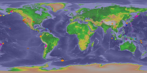
Earthquakes - Real-time
Earthquakes occur naturally everyday. Anything that causes seismic waves to radiate throughout the Earth is an earthquake.
There are two main types of earthquakes, tectonic and anthropogenic (caused by humans).
- Tectonic earthquakes are naturally occurring and are caused by earth movement. The surface of the Earth is composed of a mosaic of tectonic plates moving with respect to each other. When two plates glide past one another, a stress builds up at the boundary. When that stress reaches a critical level, the boundary slips and the result is an earthquake. The traces of repeated slips are known as fault lines.
- Anthropogenic earthquakes can be caused by drilling for fossil fuels, extraction of minerals, huge explosions, and the collapse of large buildings.
Earthquakes - View and Interactive Sphere. This dataset is updated hourly (new tab):
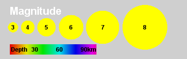
The Richter Magnitude scale
The Richter magnitude scale was created to rate the strength and magnitude of earthquakes. It is a base-10 logarithm scale of ground motion 100 km from the epicenter. Each increase of 1 magnitude means 10 times greater ground motion.
To measure the amount of energy that was released during an Earthquake, a base 32 logarithm scale is used. This real-time data-set shows the earthquakes that daily happen around the world that are greater than 2.5 on the Richter scale.
With the current database from the USGS Earthquakes Hazards Program of the U.S. Geological Survey (USGS), many earthquakes outside of the United States under 4-5 magnitude on the Richter scale are not reported.
The size of the circle is proportional to the magnitude of the earthquake, with bigger values on the Richter scale represented by bigger circles. The coloring of the circles is based on the depth of the earthquake below the surface according to the provided color bar. After an earthquake occurs, the representing circle fades out over a seven day period.
Most earthquakes are small enough to hardly be noticed; however, some can be very powerful causing widespread death and destruction and can even trigger tsunamis.
Latest Earthquakes on Earth: USGS Earthquakes Hazards Program of the U.S. Geological Survey (new tab).
More information: Science on a Sphere, National Oceanic and Atmosperic Administration (NOAA) (new tab).
Biosphere: Marine Chlorophyll. Concentration and Land Vegetation
The term biosphere refers to the regions of the surface, atmosphere, and hydrosphere of the Earth occupied by living organisms. This video shows quantity of marine and land-based plant-life as it changes throughout the seasons of the year.
The oceans are shaded on the basis of chlorophyll (green pigment in plants) concentration. Greener water signifies an abundance of phytoplankton, while bluer water indicates less. Red patches in the ocean often occur at the mouth of a major river and indicate an abundance of life caused by run-off containing higher concentrations of fertilisers and other nutrients that find their way into the rivers.
The lands are shaded to depict the vegetation. Green areas have abundant vegetation, yellow areas have little vegetation, and brown areas have no vegetation. Black patches in the video indicate places where data is not obtainable. Near the poles, this happens because of lack of sunlight during the winter season, whereas near the continents, like off the coast of Africa, it indicates lack of data due to particles in the atmosphere that are blocking sunlight, like smoke or dust.

More information: Science on a Sphere, National Oceanic and Atmosperic Administration (NOAA) (new tab).
Human Transportation
This image of the Nighttime Lights - 2012 is combined with data showing the human footprint of global transportation on land, in the air, and by sea. The base map of this image shows nighttime lights visible from space, which indicates areas where people live, work, and consume energy.
Red lines represent 87 000 daily flights connecting cities and cultures around the world. Blue lines represent the paths of 3500 commercial vessels over the course of a year, which is only 10% of total ocean shipping traffic. Green lines represent the world’s roads, used by over 1 billion motor vehicles. This colourful globe shows the interconnected nature of the world, but also how much energy we use to move people and goods around the planet’s surface.
It’s important to note that the nighttime lights data includes all lights at night, not just electricity;
for example, both natural and man-made fires as well as gas flaring from fossil fuel extraction can be seen in places like west central Australia, West Africa, and Siberia.
More information: Science on a Sphere, National Oceanic and Atmospheric Administration (NOAA) (new tab).
Precipitation, Real-time
Precipitation (falling rain and snow) that occurs around the globe is the source of fresh water on which all life depends.
The heaviest precipitation is found in the persistent band near the Equator, known as the Intertropical Convergence Zone. Just outside this area, more noticeably in the Northern Hemisphere, the tight swirls of tropical storms (including hurricanes and typhoons) can be seen occasionally in the northern summer.
At mid-latitudes, the storm tracks display the swirls of low pressure systems and bands of frontal precipitation. Note the opposite directions of circulation in the Northern and Southern Hemispheres! Important year-to-year and shorter-interval variations cause strong modifications to local conditions, bringing droughts and floods.
The dataset used in this film is provided by NASA in near-real time, about six hours after the observation.
More information: Science on a Sphere, National Oceanic and Atmospheric Administration (NOAA) (new tab).